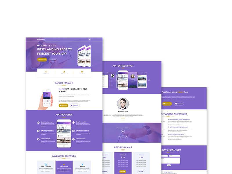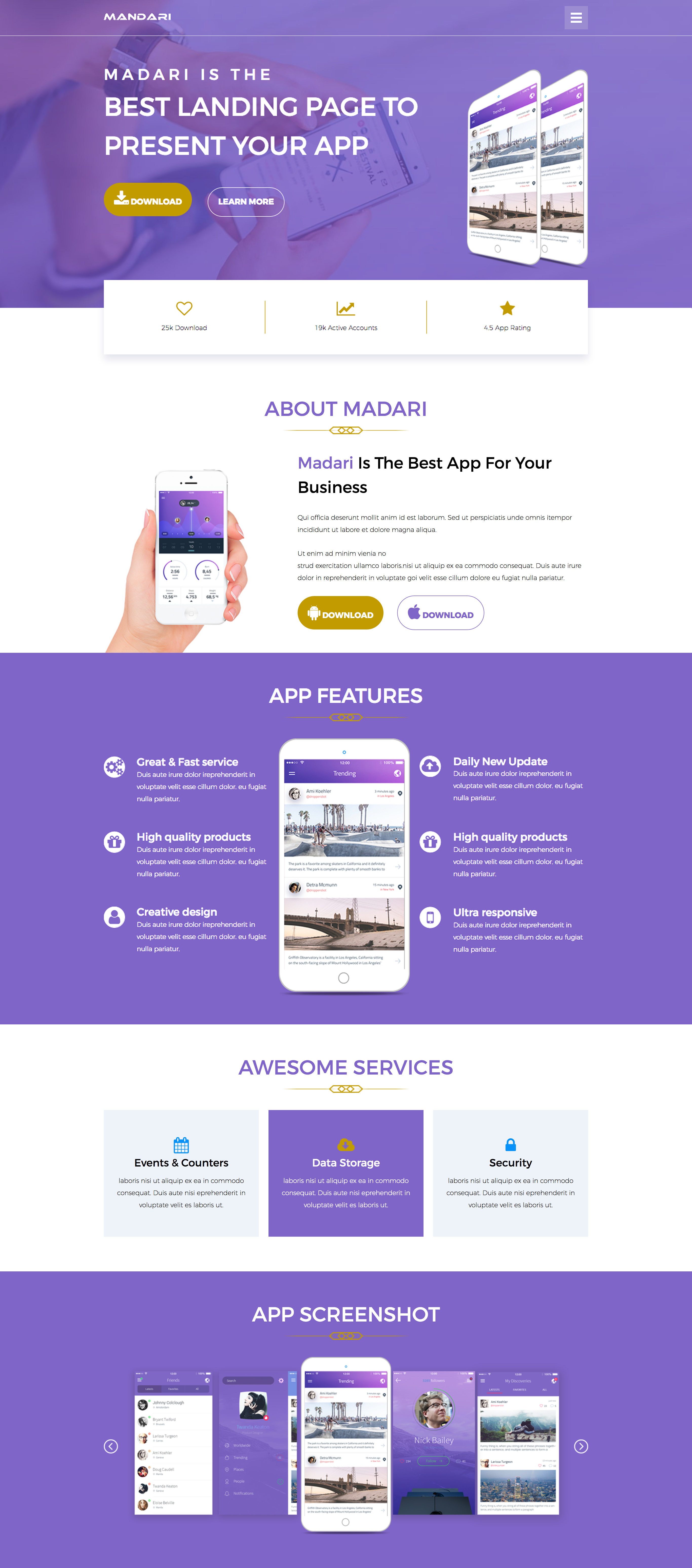
Best landing page to present your app.
I worked on the development of a landing page based on the designs of a fellow designer. A striking resemblance, am I right? I treated the design as a template so that it can be used for any app. The purpose of the page is to provide information regarding an app. The call-to-action is downloading the app, so ample download buttons were strategically placed throughout the page.
Frontend Developer
Graphic Designer and Copywriter
Photoshop, HTML5, SCSS, and Flexbox
Experimentation (Mobile & Web)
I partnered with Ibrahim Emranto to work on the frontend develop in 2017.
My duties for this project were frontend development, responsiveness, search engine optimization (seo) and coding the entire site. I read a few articles on resources like Smashing Magazine about proper development, different types of semantics and writing reusable lasting code. I wanted to challenge myself and decided to set some limitations. I would use semantic classnames, alphabetize CSS, not use '!important', reduced style redundancies and utilize git.
To complete this project, I utilized the provided PSD, SCSS, Flexbox, HTML5, CSS selectors, a CSS linter and Atom.
I designed an addition to the page to add my touch to the design. I worked on the navigation menu and was careful not to stray far from the original design. I added an animation with a full-screen transparent overlay to the menu. This was built using CSS and Javascript. The mock-up didn't include navigation so I decided to make the call. The way the menu now opened fits well with the hamburger menu and page design. When the hamburger menu is clicked a delightful micro-moment is experienced when the three bars being turned into an 'X'. The symbol of an 'X' also helps to show users how to navigate away from the menu.
In the Photoshop Document (PSD) the background image has a color overlay. Getting the same effect in CSS was a challenge. Using a modified version of the image would be a quick solution but I want the site's code to be easily reusable. As a landing page template, if a color aside from purple was chosen, then the image would have to be remade in Photoshop. I placed the original image as the background and figure out how to apply a color overlay with CSS. The idea of developing it like a template was also why I created the project in SCSS. By setting the colors up as variables changing the site's color scheme could be easy.
Another achievement was the site's responsive aspects. The Photoshop Document (PSD) I was given showed responsiveness by scaling down the design to tablet and mobile size with the elements and placements STILL remaining intact. Nothing in the design changed, the elements just scaled smaller. While in actuality this would result in an unusable product, especially on mobile. I ended up creating my own responsive version.