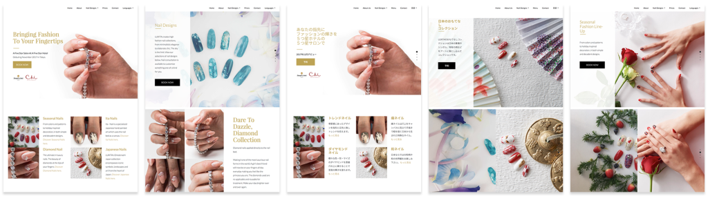
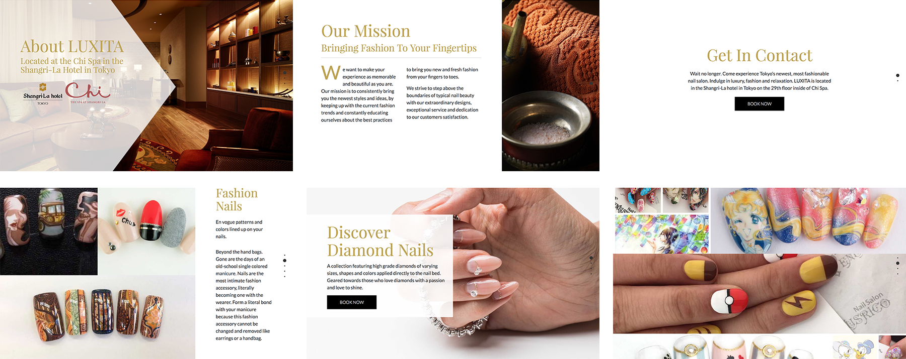
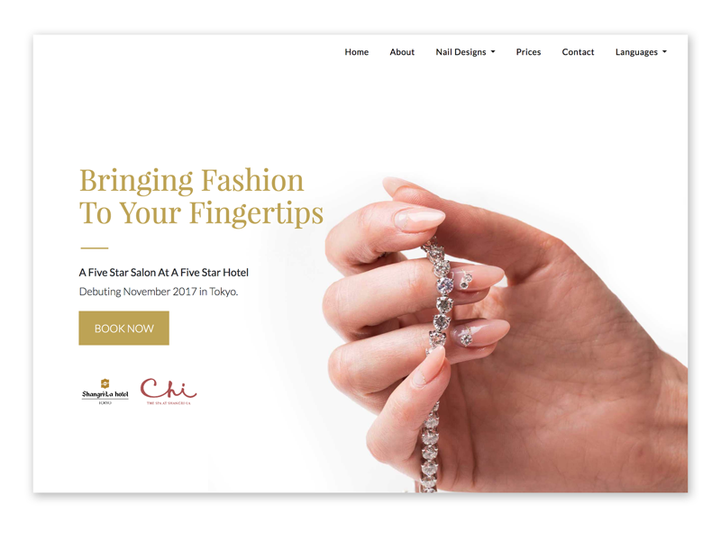
Project Goals
The goal of this project was to create a luxury brand website appealing to both foreign tourists and Japanese natives. While designing, I needed to avoid the design pitfall of clutter commonly seen on Japanese websites.
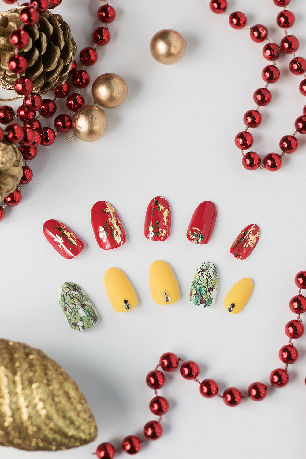
Credit: Katherine Delorme